
esc
Return
Refining the brand
Restructuring the frontend
Reducing information load on users
Making range data clear & comparable
Nordic EV Database
← Return
Redesigning a public database
for electric vehicle battery performance
creating a data-focused UI through user research and iterative design testing – resulting in intuitive visualizations, improved hierarchy and responsive layouts
→ Making complex vehicle data easy to understand and compare.
Role
UI & UX designer
User Research
Tools
Figma,
GPT
Duration
6 Weeks

🗒️
Context
What we were dealing with
The FLTP testing procedure is designed to measure
the consumption and range of electric cars in nordic driving conditions.
Their public database provides precise, real-world insights into vehicle performance, enabling buyers in tougher climates to make confident, well-informed decisions when considering electric vehicles.
🔨
Task
What we were dealing with
Our team was tasked with completely redesigning and rebuilding the database frontend & backend – aimed at improving the experience for both users and administrators of the service.

Challenges
What we were dealing with
The existing service provided users with a lot of valuable data and insight but was overwhelming, lacked in visualization and had major issues in information hierarchy.
Inputting, managing and calculating test data was cumbersome, built on a manually operated system and dependent on external services not built for this purpose.
✅
What was delivered
What we were dealing with
1.
User research -driven feature set and information structure to meet the real needs and behaviors of users.
Consistent and distinct design language with reusable components for future development.
Responsive and user friendly web service with a redesigned interface that follows good accessibility practices.
A purpose-built automated backend solution for managing all incoming, existing & publicly shown data from a single dashboard.
The process
The public database contains an unusually large amount of numerical data that risked overwhelming users. This made it especially important to focus on clarity in the interface design and to remove any unnecessary elements.
H1 Restructuring the frontend
The public database contains an unusually large amount of numerical data that risked overwhelming users. This made it especially important to focus on clarity in the interface design and to remove any unnecessary elements.
H2 We improved the user experience with solutions such as
Spacious layouts and clear grouping of elements
Placing the most important content at the top of each page
Clear search functionality and filtering options
Accordion components for structured content
Clear, descriptive text (e.g., on buttons)
H2 We improved the user experience with solutions such as
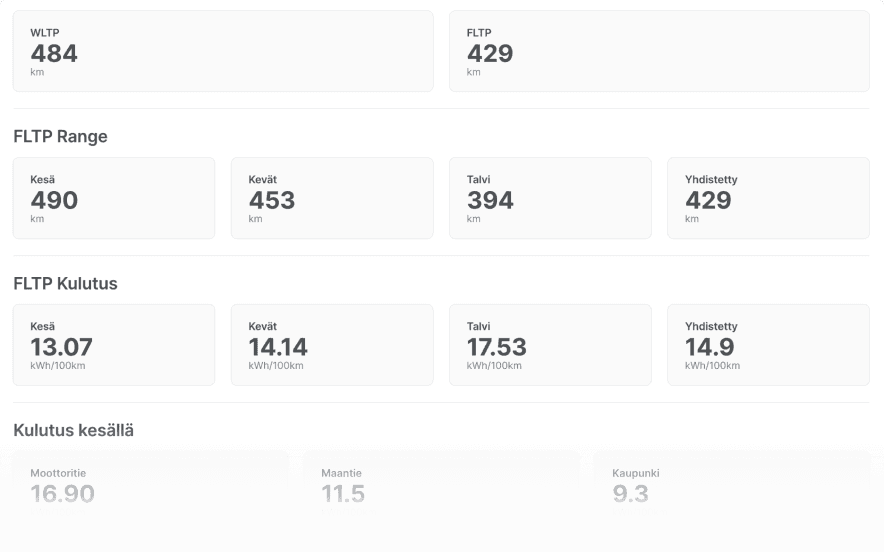

lällälläää kuvateksti wautsi
H2 without paragraph ( after img )
The public database contains an unusually large amount of numerical data that risked overwhelming users. This made it especially important to focus on clarity in the interface design and to remove any unnecessary elements.
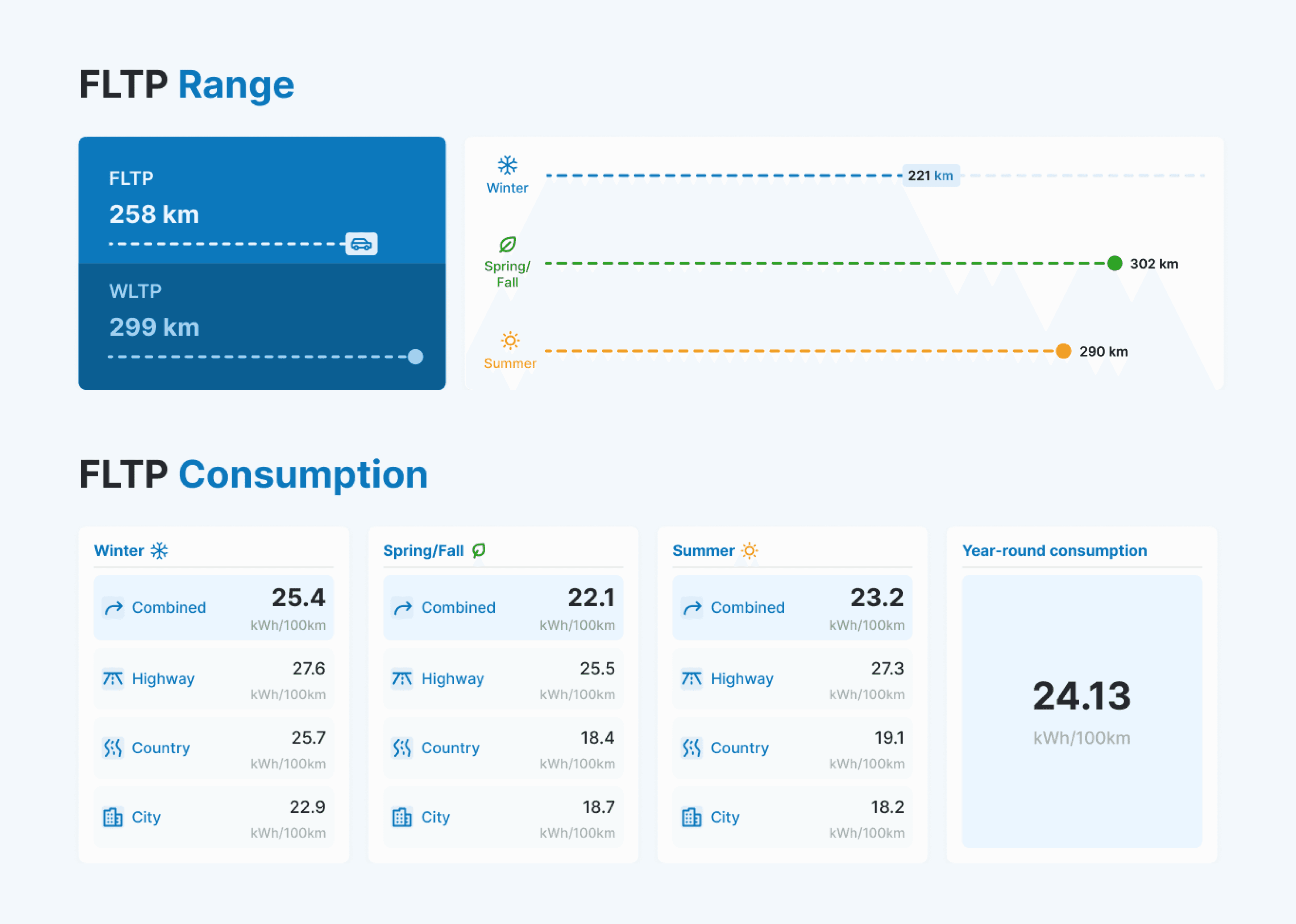
lällälläää kuvateksti wautsi
H2 without paragraph ( after img )
The public database contains an unusually large amount of numerical data that risked overwhelming users. This made it especially important to focus on clarity in the interface design and to remove any unnecessary elements.